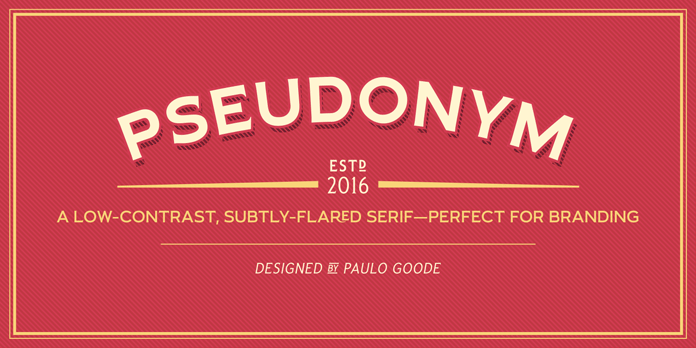
The Pseudonym font family, a low-contrast, subtly-flared serif with a lovely vintage touch.
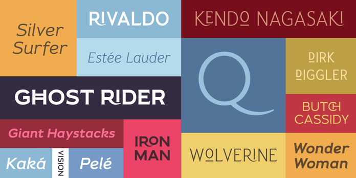
Paulo Goode, an Irish type design has created the Pseudonym font family in 2016. The slightly vintage inspired typeface is based on a low-contrast with subtly-flared serifs. Pseudonym comprises four weights across three styles in both roman and italic versions. The typeface can be used for logo designs or diverse branding projects. It’s also a great choice for signage or retro poster designs. Its incisive flared serifs blend perfectly with the sturdy look of contemporary grotesque faces. The Pseudonym font family offers a unique presence with great legibility in any media. More information below.
You can download this family for low budget as introductory offer on MyFonts.

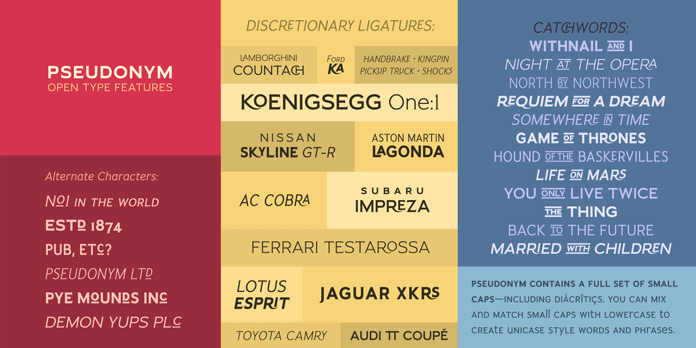
Paulo Goode has added numerous OpenType features to the family. The various features include some alternate characters, several ligatures, catchwords, small caps with their corresponding diacritics and figures, etc. Especially the alternate characters will help you to create unique logotypes with ease. The complete family is available as both ordinary desktop typeface and webfont. For additional information, please follow the link below.
The complete font family is available for purchase on MyFonts.


Follow this link to get further information about Paulo Goode’s font family.
Discover more outstanding fonts on WE AND THE COLOR! We show you classic typefaces and latest releases. No matter what you are looking for, a geometric sans, a serif or a handmade script font, you will find it in our great selection!
The post Pseudonym Font Family appeared first on WE AND THE COLOR.