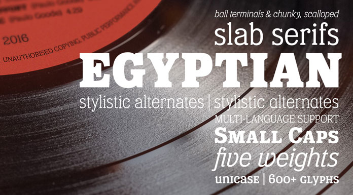
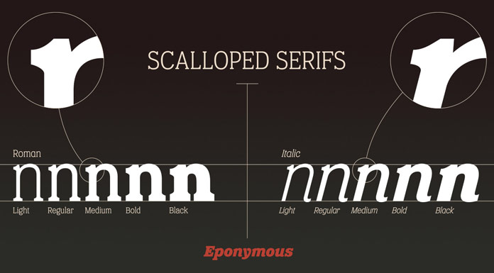
Eponymous, an Egyptian-style typeface with chunky, scalloped serifs.
The Eponymous font family is Paulo Goode’s fifth release. Driven by his passion for slab serifs, the Irish type designer wanted to develop a family that combines the classic look of an Egyptian-style typeface with the demands of today’s fonts. The result is an excellent font family based on chunky, scalloped serifs. Eponymous comes in 5 weights plus true italics for each weight. The family’s distinctive personality is a striking eye-catcher in both headlines and texts. You can read more about this outstanding font family below the first image or feel free and click on the following link.
You can buy this beautiful slab serif on MyFonts.

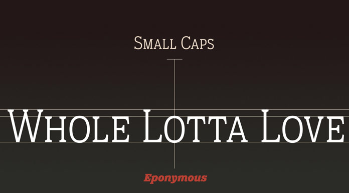
Paulo Goode has also equipped this family with plenty of OpenType features. Make use of them and implement some stylistic alternates to give your typographic work a more personal touch. You can also mix your characters with the set of small caps to create some interesting effects. With complementing diacritics and multi-language support, the Eponymous font family has been designed for professional needs.
Here is a list of the key features:
- The family includes 5 weights (Light, Regular, Medium, Bold, Black) plus true Italics
- OpenType features with small caps, diacritics, figures, and alternate characters
- An extended character set with 600 glyphs that supports multiple languages
- Available as both webfont and ordinary desktop font
You can buy this family on MyFonts.


The full family is available for purchase on MyFonts.
Do not hesitate and discover more typefaces in our recommended Fonts category.
The post Eponymous Font Family appeared first on WE AND THE COLOR.